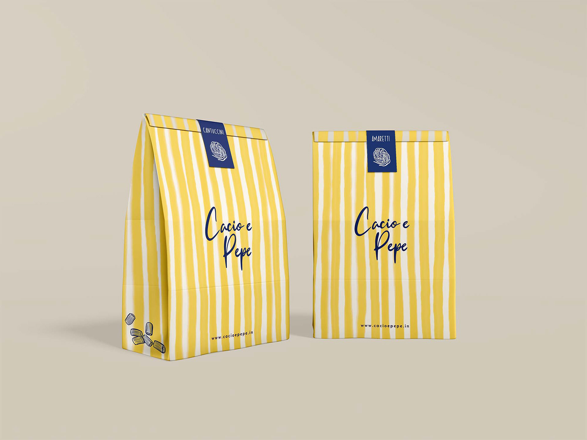
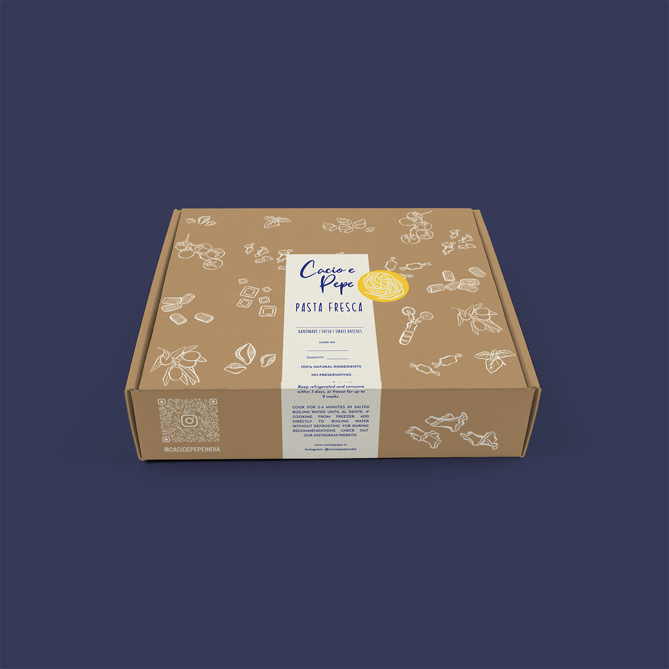
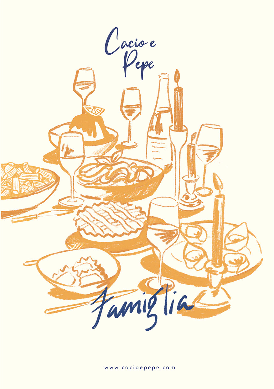
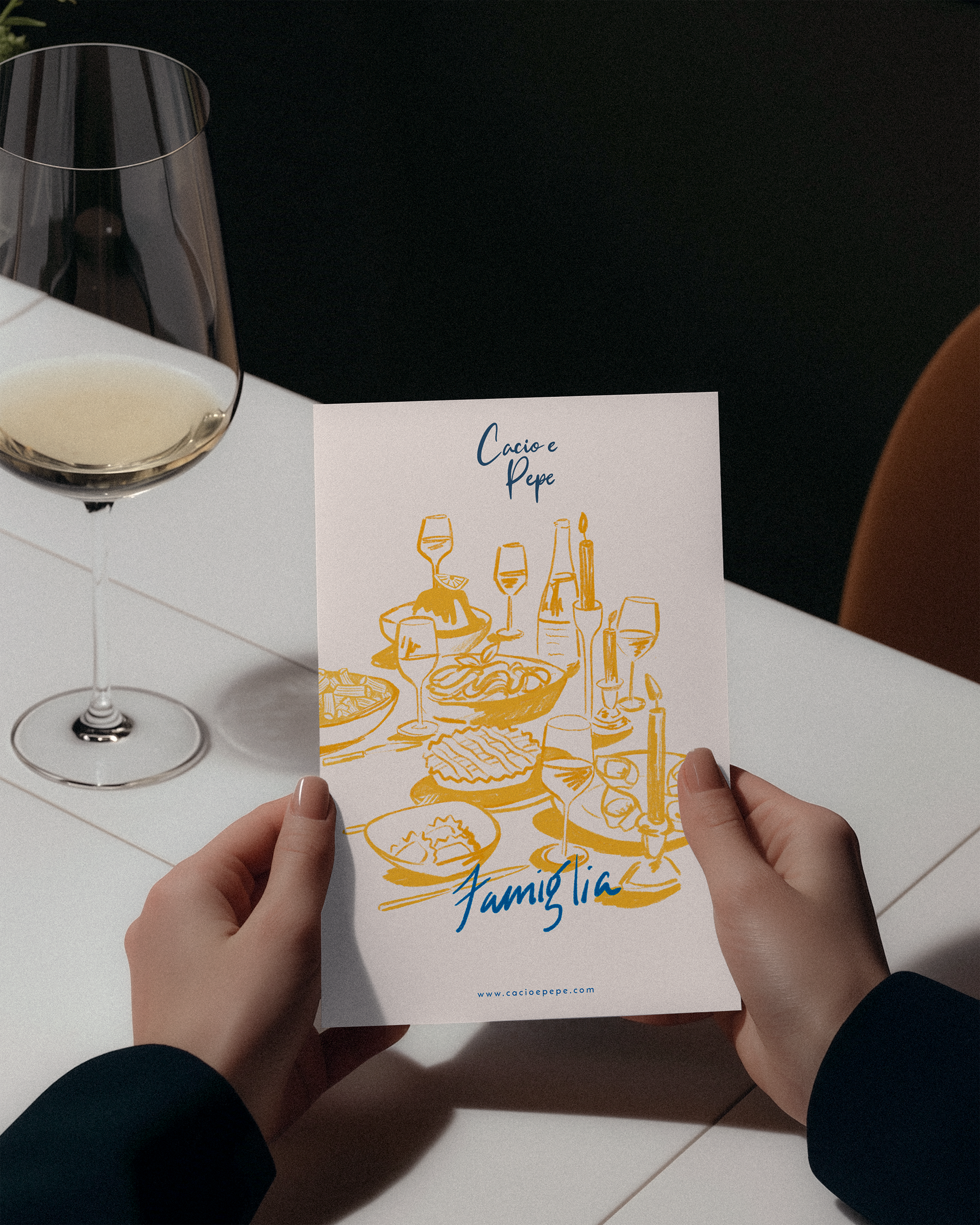
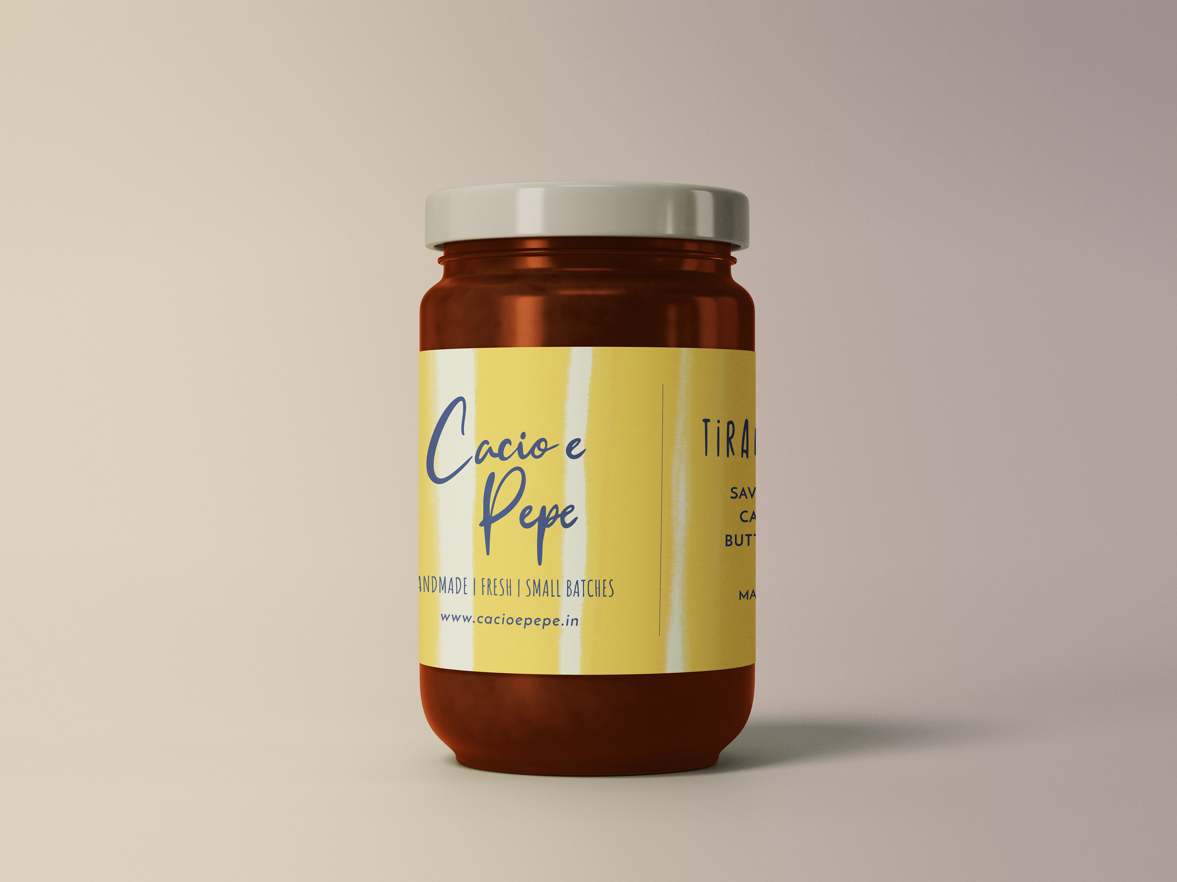
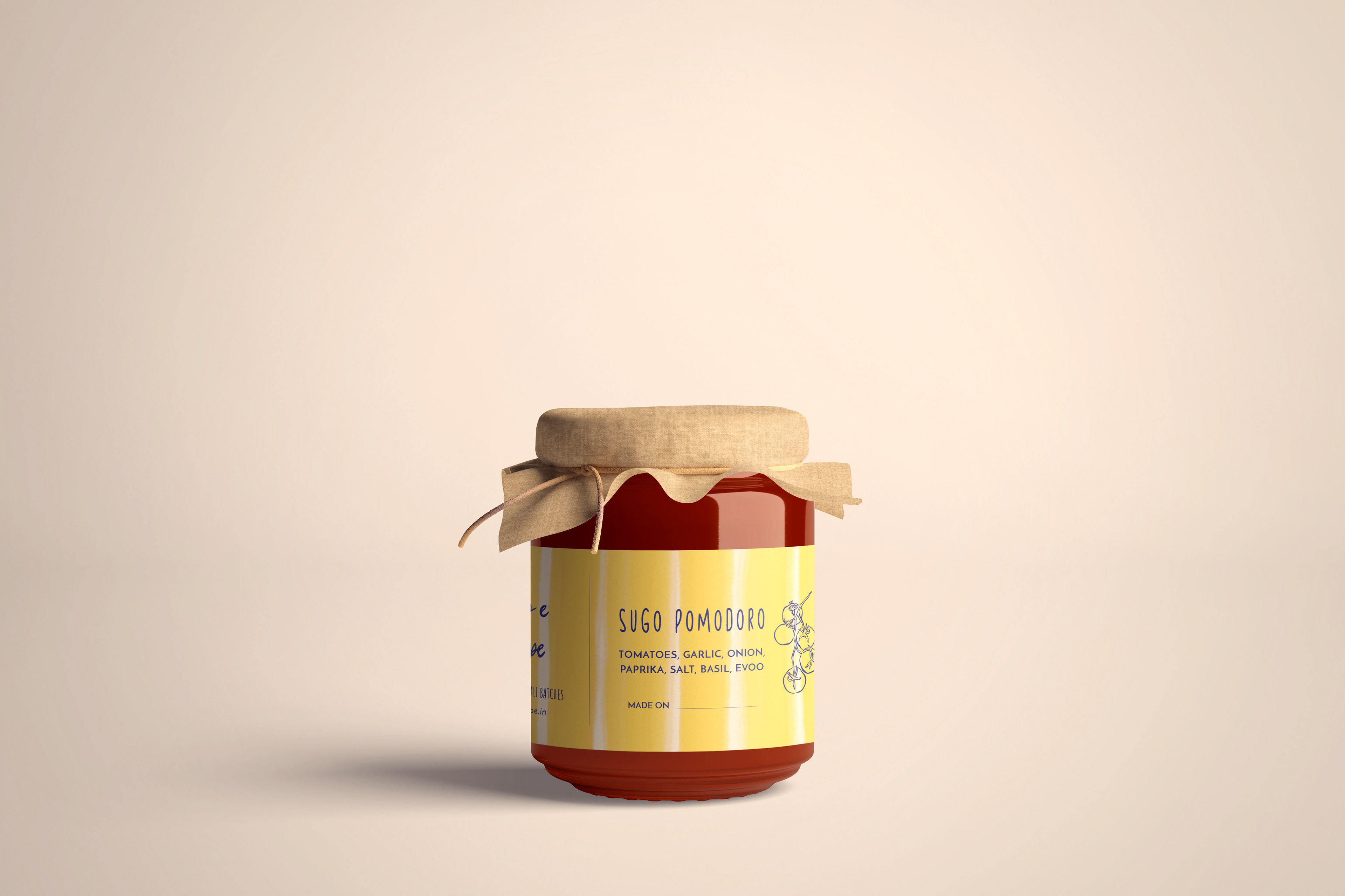
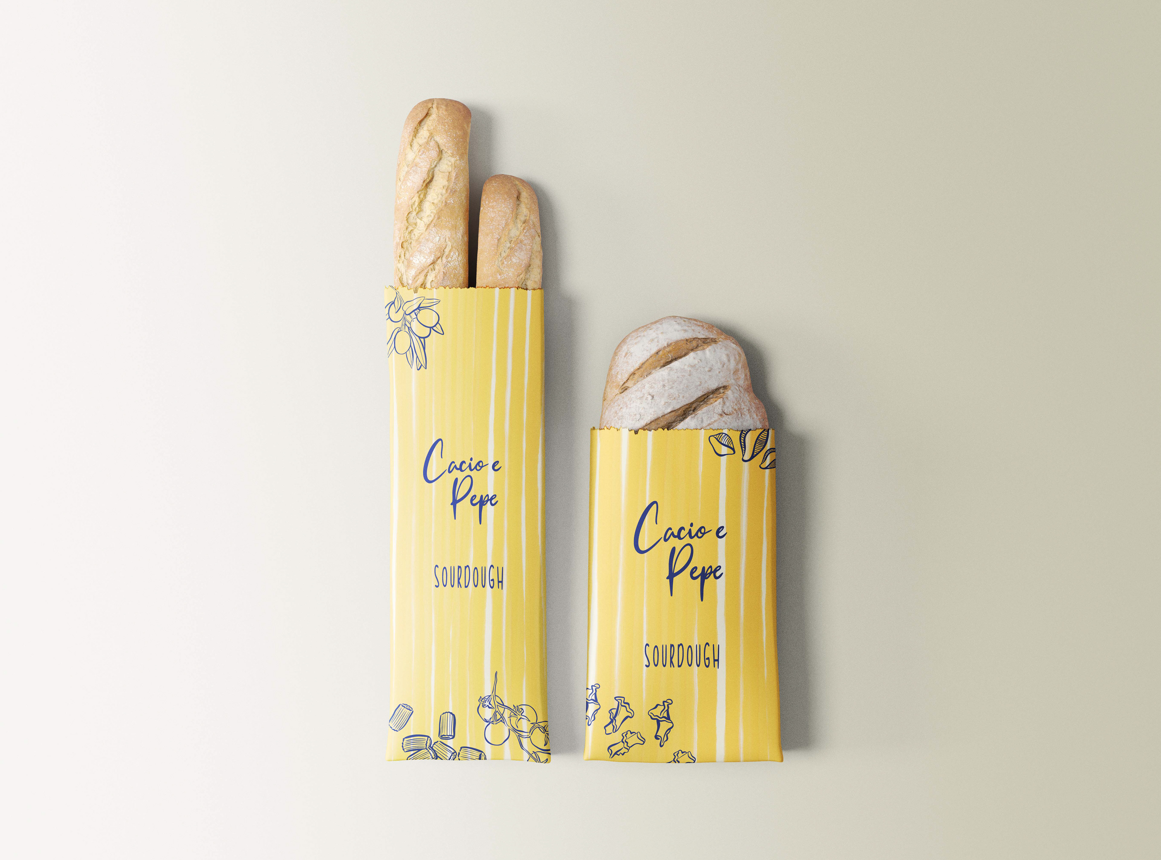
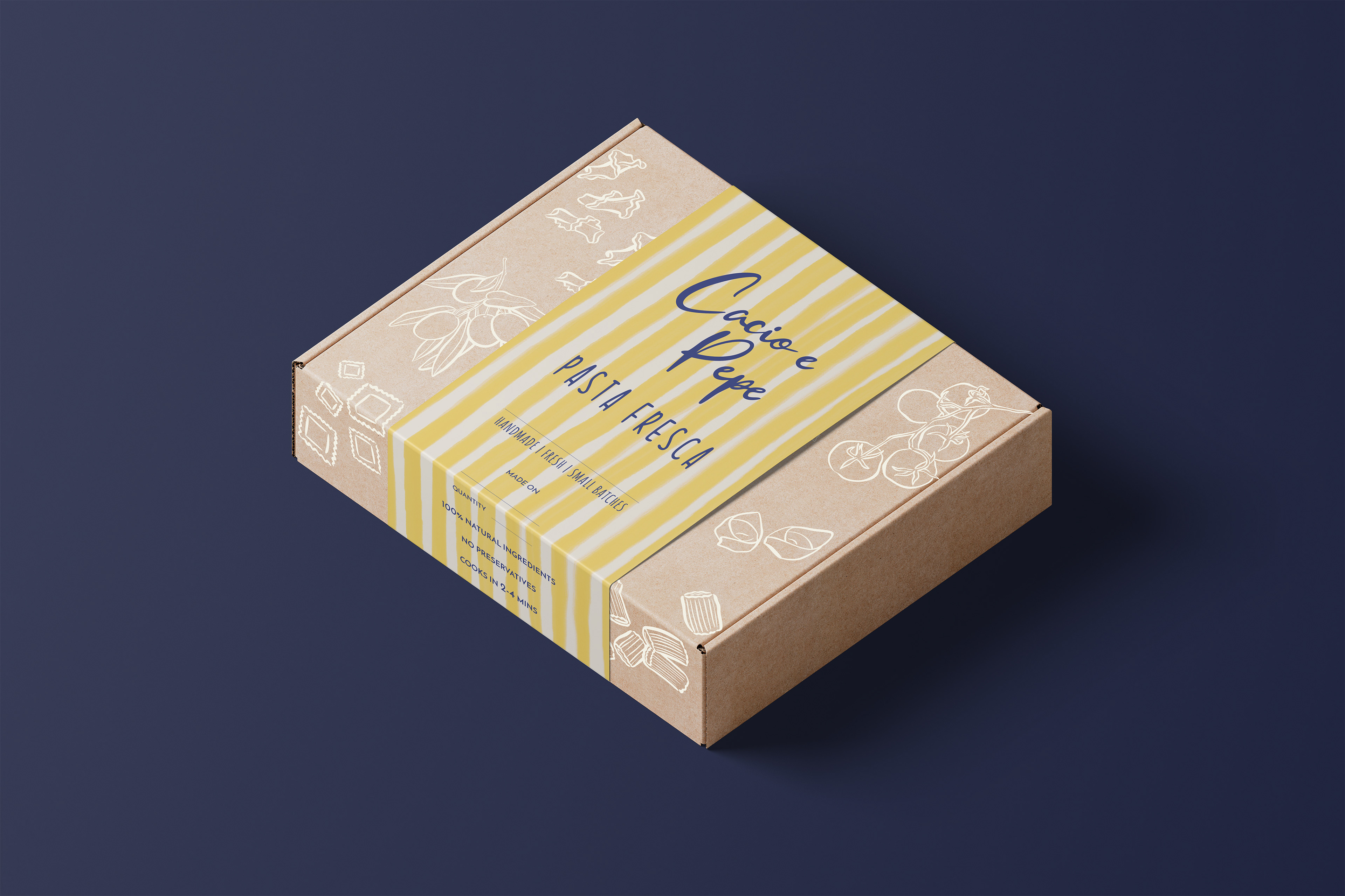


Cacio e Pepe is a premium pasta brand that celebrates authentic Italian flavors with artisanal, handmade pasta varieties. They needed a packaging refresh that would elevate their brand presence while maintaining their established identity. THE CHALLENGE & SOLUTION The brand wanted a refresh, not a complete overhaul. I elevated their existing script logo into a cleaner, more refined handwritten typeface and simplified their visual identity by replacing the complicated illustration with a clean spaghetti emblem. While keeping their signature yellow branding, I added depth with a midnight blue accent and introduced watercolor stripe textures along with hand-drawn illustrations. The real challenge came from their extensive product range—each pasta variety required different cooking instructions and storage details. I designed a flexible packaging system using removable, interchangeable sleeves and stickers that could adapt to any product while maintaining brand consistency. The hand-drawn illustrations became a key element, nodding to the artisanal nature of their pasta and celebrating the beautiful variety of shapes and sizes in their range. THE RESULT An identity that perfectly balances fun and artisanal—elevated enough for premium positioning, yet approachable and authentic to the brand's handmade ethos.