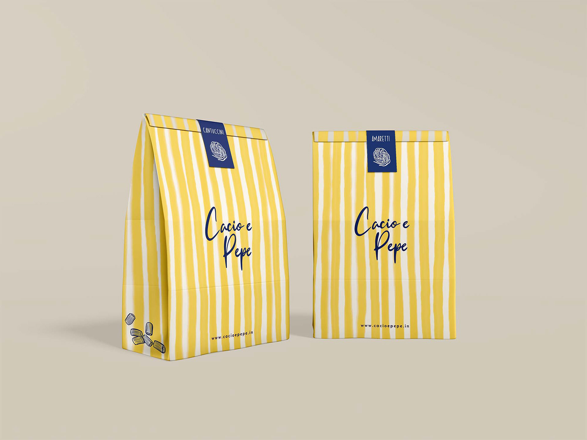
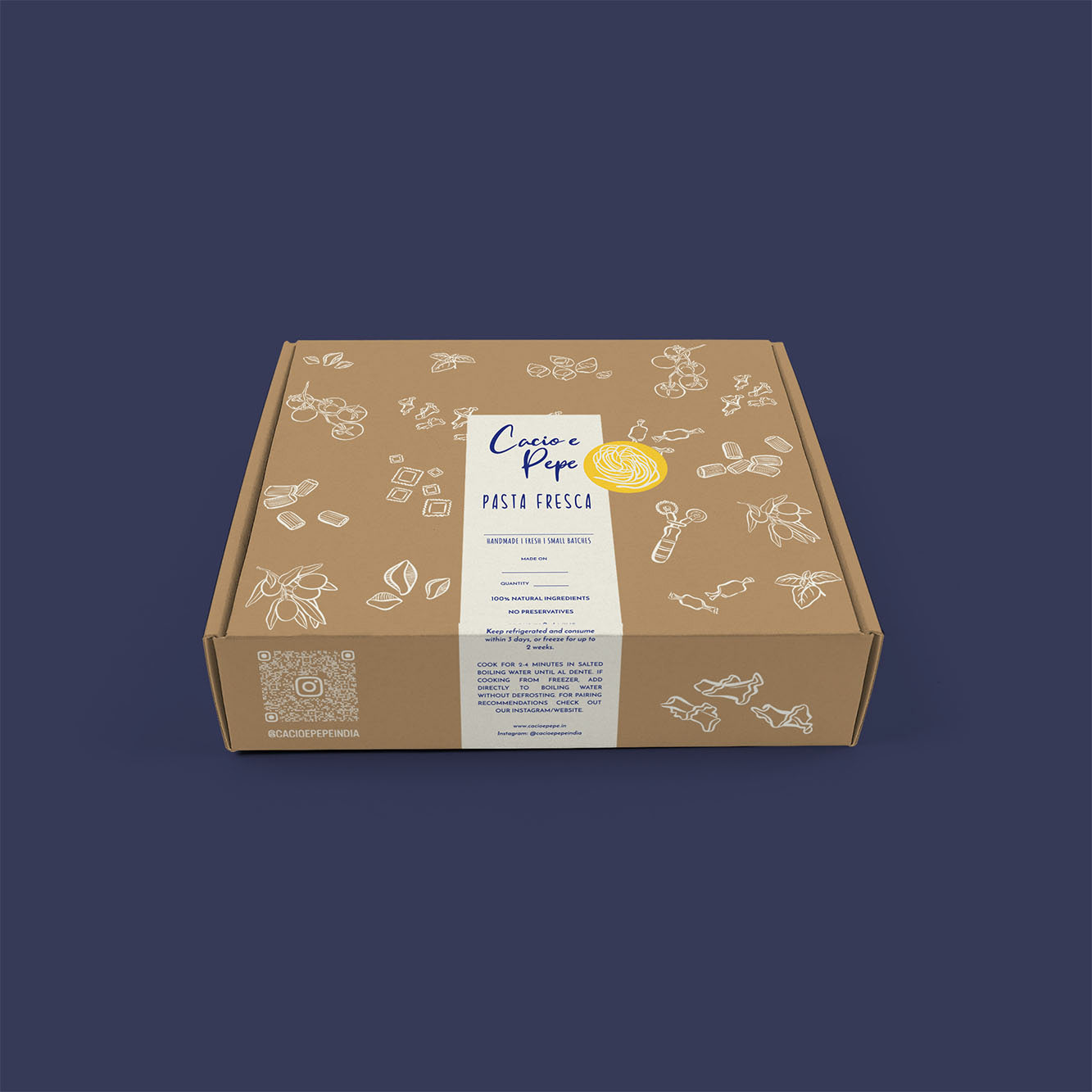
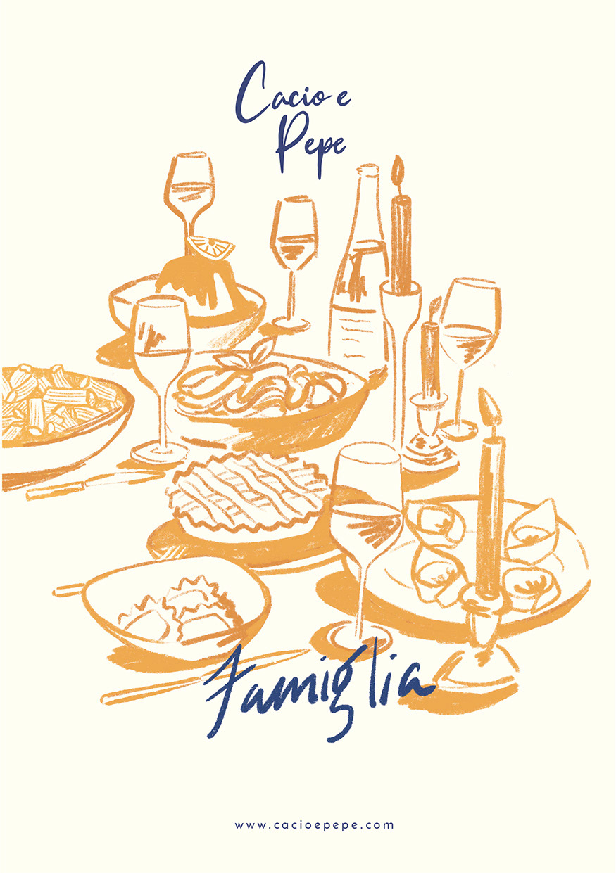
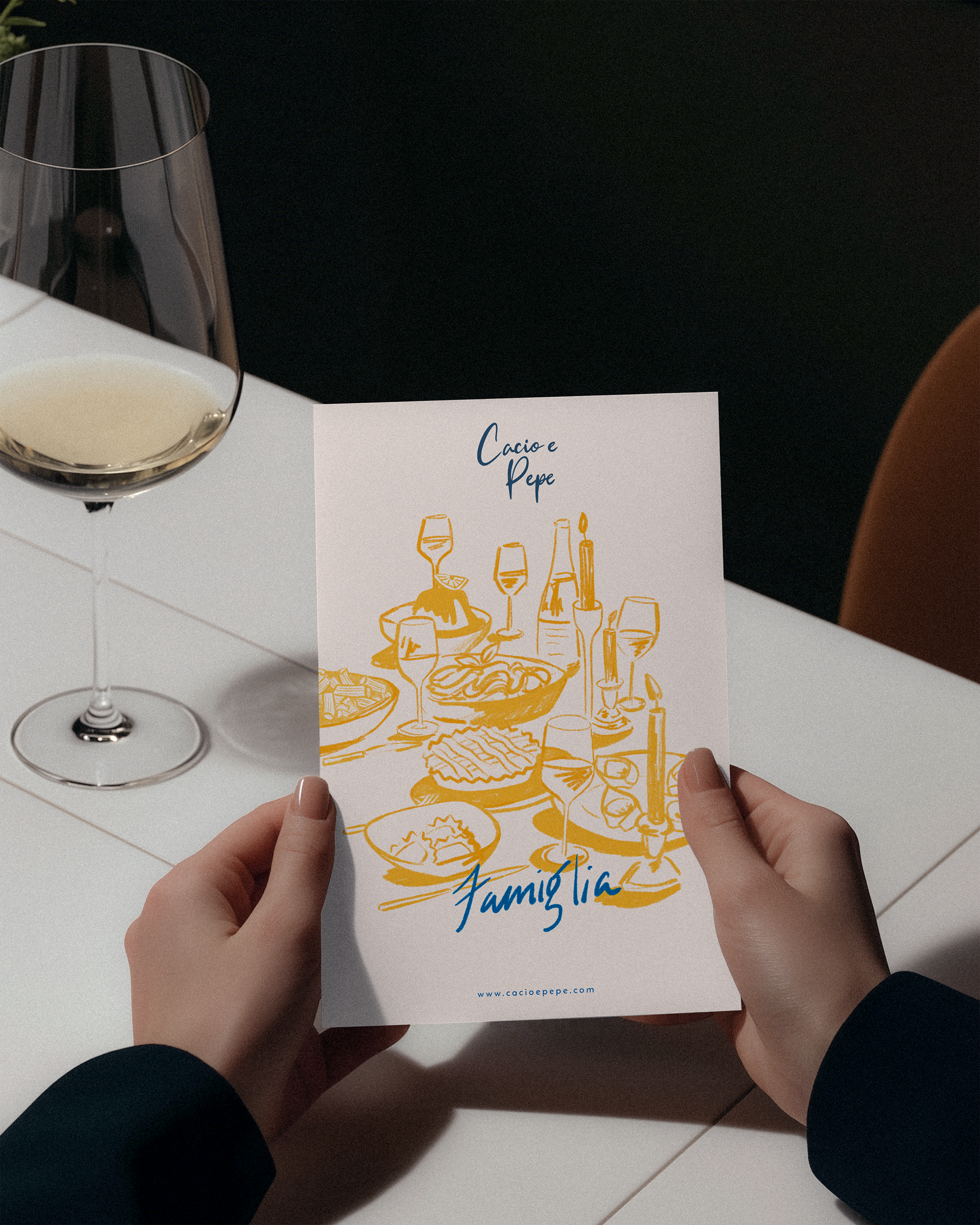
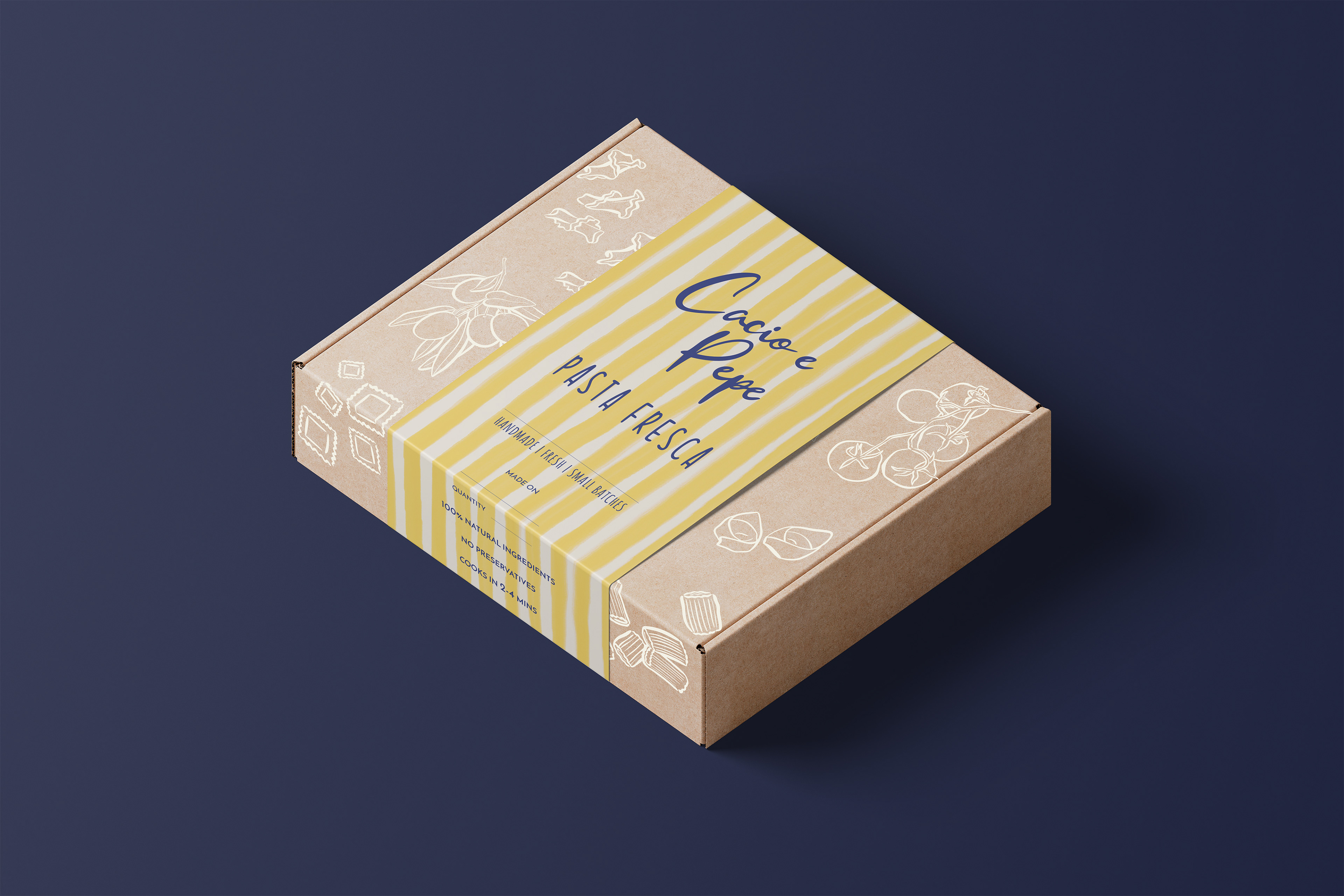


THE CHALLENGE Cacio e Pepe, a brand specializing in fresh pastas, sauces, condiments, dips, and sourdough bread, needed a comprehensive packaging redesign that could work seamlessly across their diverse product range. The primary challenge was creating a flexible design system that maintained brand consistency while adapting to multiple SKUs and varying package sizes. While they wanted to retain their signature yellow color, the existing stark yellow-and-black palette felt too harsh and didn't effectively communicate the artisanal, handcrafted quality of their products. Additionally, the original logo—a script text with spaghetti elements—lacked the sophistication needed for the brand's evolving positioning. THE SOLUTION I began by refining the logo, polishing and simplifying the script to create a more sophisticated mark that would work effectively across all touchpoints. I then refreshed the brand identity by softening the original color palette and introducing a watercolor gradient with stripes that retained the signature yellow while adding visual depth and warmth. To elevate the brand's sophistication, I shifted the primary identity color to indigo blue, creating a more premium feel and better contrast across applications. The packaging features hand-sketched illustrations of ingredients and culinary elements, reinforcing the artisanal nature of the brand and adding a personal, handmade touch. This modular design system provided the flexibility needed to work across their entire product line—from small condiment jars to larger pasta packages—while maintaining a cohesive and recognizable brand presence. The combination of the refined logo, flowing watercolor stripes, and detailed illustrations created a distinctive shelf presence that communicates both quality and authenticity, setting Cacio e Pepe apart in the fresh food market.